All posts filed under: Inspiration

How to embrace autumn

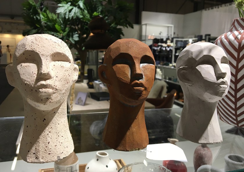
Autumn has arrived in my part of the world and I feel my spirits lift on my walks, when I take in the beautiful scenery of leaves that are turning into every shade of red and yellow. The mornings are becoming crisp and even though the weather is mild at the moment, one has the feeling that in no time at all it’s time for wooly mittens, scarves and coats and summer is a mere memory. How do I approach the change of the seasons? As I’ve mentioned earlier I became inspired by Wabi Sabi, when I visited the home of Elissa in New York, on my travels to explore what a home means to people*. Wabi Sabi is a Japanese philosophy that embraces the transience of life, whether nature’s changes, the different phases of human existence or the imperfections found in objects. The keyword that has worked for me is the word embrace. I do so love that word! I found that in actively changing my thoughts about a change I don’t particularly like or …

Colour of the year 2019

UK paint brand Dulux has appointed ‘Spiced Honey’ as the colour of the year 2019, as part of the brand’s industry-acclaimed ColourFutures trend forecast. Spriced Honey is a versatile shade filled with warm and inviting tones of amber and rich caramel. “2018 was an unsettling and unpredictable time,’ says Dulux. ‘We were overwhelmed by the deluge of news, choices and demands upon our time, causing us to close up and retreat into spaces where we feel safe and cocooned. We pressed pause and took time to regroup.” “As we move forward into 2019, we find this pause has given people time to re-energise and deal with the sense of unpredictability with positive action, optimism and purpose. If the unpredictability of last year forced people to retreat and regroup, 2019 is the time for their awakening. We are ready to ‘Let in the Light’.” Other paint brands such as Jotun have similar shades in their new colour palette for 2019. Jotun’s RAW-Palette we find warm earth colors, neutral gray shades and burnt reddish tones. LADY 12085 Rural LADY Pure Color 20118 …

Inspiration from Formex

The main trend seminar at this season’s Formex, was held by one of our times greatest trend analyst Lilly Berelovich from the New York-based trend agency FS Creative. I was so excited to find that many of the influences and tendencies she shared with us, show up in the homes of my book Home Life Around the World. The slow living trend is something that many of us yearn for in the busy and fast paced life of today. The chapter Wabi Sabi in Brooklyn highlight the love of handmade craft and embrace the idea of the imperfect. Healing Spaces celebrate the patina and aged beauty of furniture that have had an earlier life. In pursuit of happiness we seek to reconnect and live a life in harmony with nature as in Living Off-the-Grid. Realising the importance of silence in the chapter A peaceful Haven and creating an equilibrium in life in Visual Quietness, both show us ways to keep us connected with ourselves. The chapters Consciously Minimal and Industrial living are perfect examples of how work and home life are interconnected in the …

Snapshots from Formex design fair

I visited the 108th edition of Formex spring fair. The theme of this season’s exhibitions was “A World of Shapes“. The designer and exhibition architect Synnöve Mork was in charge of “Layout“, the exhibition at the main entrance. Specially invited to interpret the theme and to put together the actual content were interior design stylist Saša Antić, stylist Tina Hellberg and artist Cilla Ramnek. I wanted to keep abreast with the latest trends, but what especially drew me to the fair was the opportunity to listen to one of the world’s most famous trend forecasters, Li Edelkoort. I was not disappointed. She held a really inspirational talk about future lifestyles and trends. The essence of the lecture was that an antithesis to the digitised world is emerging, where a strong desire to return to tactile values is prominent. Handicraft and crafts in all shapes and execution are on the horizon, and evidence of this is here already. Take a peak at some of the goodies I found at the fair. Coarse textiles, crafts, wooden objects, organic shapes, rattan, …

The Apartment

The Apartment in Copenhagen designed by Ilse Crawford and her team at Studioilse has a wonderful ambience. Muted wall colors and furniture blends perfectly with well chosen materials in the furnishing, mixing natural fibers and brass, dark wood with pale wood. Thick rugs on the beautiful wooden floors, sheep skins on armchairs, a lovely throw lying casually on the bed and books piled on coffee tables and in bookcases, create a homely but stylish wholeness. My favourite is Franco Albini’s rattan chair Gala Lounge Chair that looks so good against the charcoal wall, rug and grey sheep skin. The thick dark Beni Quarain Rug under the hammock strung between the wall and a bookcase is another. On the whole it’s a marvellous array of materials, textures and hues that work well together. The Apartment is a gallery founded by former Sotheby’s specialist Tina Seidenfaden Busck, features modernist art and design in an 18th-century space presented as if it were a private home. It was last autumn that this interior was displayed and it came to my mind as Ilse Crawfords has a new range in collaboration with …

Clever ways of using mirrors

Using a mirror is a great way to enlarge a small space so that it visually feels bigger. It can also be a way to increase the natural daylight in a room that doesn’t benefit much from it, like a north-facing room. Brighten a dark area of a room by hanging a mirror where it reflects the daylight from the window. Or use it to trick the eye into believing that there is a window or a doorway, creating an illusion of a architectural feature where there is none. And of course, mirrors in themselves can be very decorative. Use several and group them together to create something striking. Keep a theme like only using round mirrors. Or only mirrors with the same kind of frame. Vintage mirrors is also a way of enhancing an era. If you can’t find the right kind of mirror, here’s one tip that maybe can be useful. Take an old picture frame that you like, remove the picture and insert a mirror in the frame. I always stress that …

Contrast creates interesting homes

Give your home exciting content with the aid of a well thought out color scheme. Just as if you would create a play or a movie, a home also requires a certain amount of dramaturgy. A black staircase in an otherwise white room really makes a statement. A dark floor as well as a dark ceiling defines the height of the room making you experience the ceiling as lower than it is. An alcove painted black in an otherwise white room creates not only a cozy, relaxing space but also a room within a room feature. Or make for example a passage between two bright rooms dark, and you will get an exciting transition. And a great way to highlight an architectural detail is by emphasising it with a contrasting color. A dark color can also be used to accentuate a feature such as a bookcase. Or to create a striking backdrop for your collection of pictures and paintings, making them really stand out. Maybe highlight one wall in a room as a eye-catcher. Light meets dark. Soft faces matches hard. Make the flow …

Boho homes

Bohemian-style is for those who enjoy creatively thinking outside the box. This design style is all about an eclectic mix of colors, patterns, textures and fabrics. Create it with odds and ends picked up on travels around the world, vintage pieces, heirlooms, old books, pieces of art, especially old art, decorative figurines, lots of soft furnishings such as pillows and generally load up with accessories. More is more. Blend different textures, such as wood, metall, glas, natural fibers, wool and animal skins, as a way to master this look. The key to doing it successfully is that nothing can match, nothing is new and don’t stick to any rules. True bohemian style is achieved only when the room appears as if it has grown organically over the years. If you don’t want to follow any design trends, perhaps this style is for your? Playful, inspiring or challenging? Which one of these seven homes is your favorite?     Photo sources: 1. http://theselby.com/galleries/aldo-chaparro-artist-at-home-in-mexico-city/, 2. http://thedesignfiles.net/2014/08/sydney-home-dion-antony-anna-feller-and-family/, 3. http://www.anahataart.com,  4. http://www.dewittenijl.be/antwerpen/, 5. http://www.anthropologie.eu/anthro/index.jsp, 6. http://thedesignfiles.net/2013/09/fremantle-home-trish-bygott-nathan-crotty-and-family/, 7.  Pinterest. Credit: http://www.onekindesign.com/2013/07/12/43-bohemian-chic-interiors-to-rock-your-senses/   SparaSpara

Multifunctional living space

Love the multifunction of a big table. When not used as a dining table, it can double up as a workspace as well. A great way to furnish when living space is limited. Instead of having furniture for various purposes divided in different areas of your home, do the opposite and have all the features in one place. Make sure that you have sufficient lighting. And add really comfy chairs. Then it also works as a nice spot to gather when friends visit and you can banish the sofa too.             Credits: http://www.homeadore.com/2014/02/13/eixample-residence-loox/